
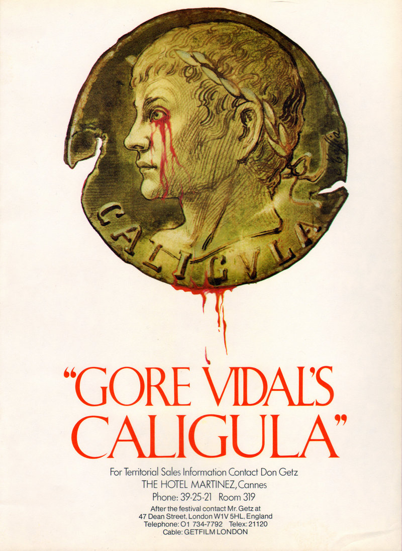
Above is probably the first advertisement ever,
spread over three pages in the Wednesday, 24 March 1976, weekly Variety.
Apparently this same three-page spread was repeated in the following day’s issue of The Hollywood Reporter
and on Friday, 26 March 1976, in Daily Variety.
Something about this advertisement bothers me more and more every time I look at it.
The production company was Felix Cinematografica Srl (Società a responsabilità limitata = Limited-Liability Company = LLC).
But there is no mention of Felix in this advertisement.
The only corporate name mentioned here is Penthouse Films International Ltd, which was not the production company,
but was instead the “Presenter,” having contributed about a quarter of the budget
by raising funds from various investors worldwide.
Interestingly, Penthouse later argued in court that the film was produced not by Penthouse Films International Ltd
or by Felix, but by a Liechtensteinian outfit called Penthouse Clubs International Establishment,
which was beyond the reach of both Italian and US law.
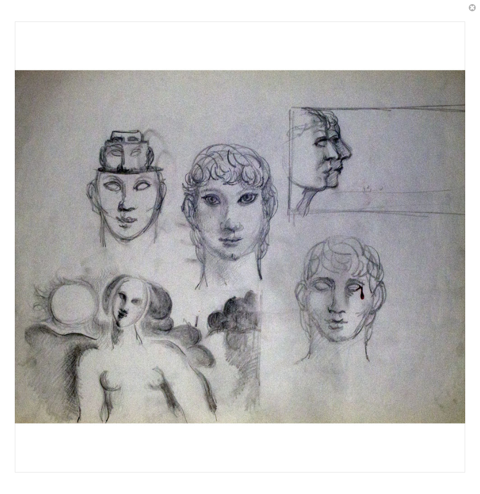
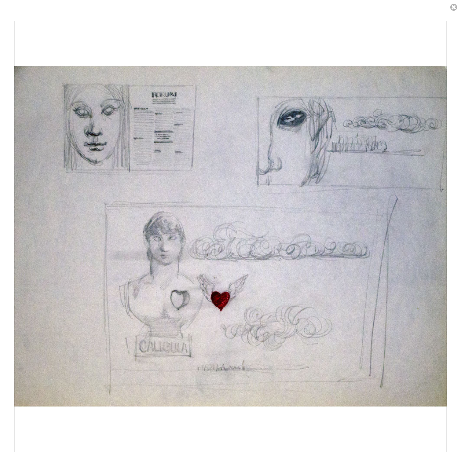
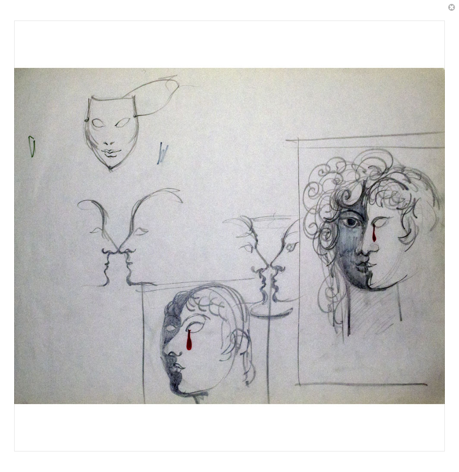
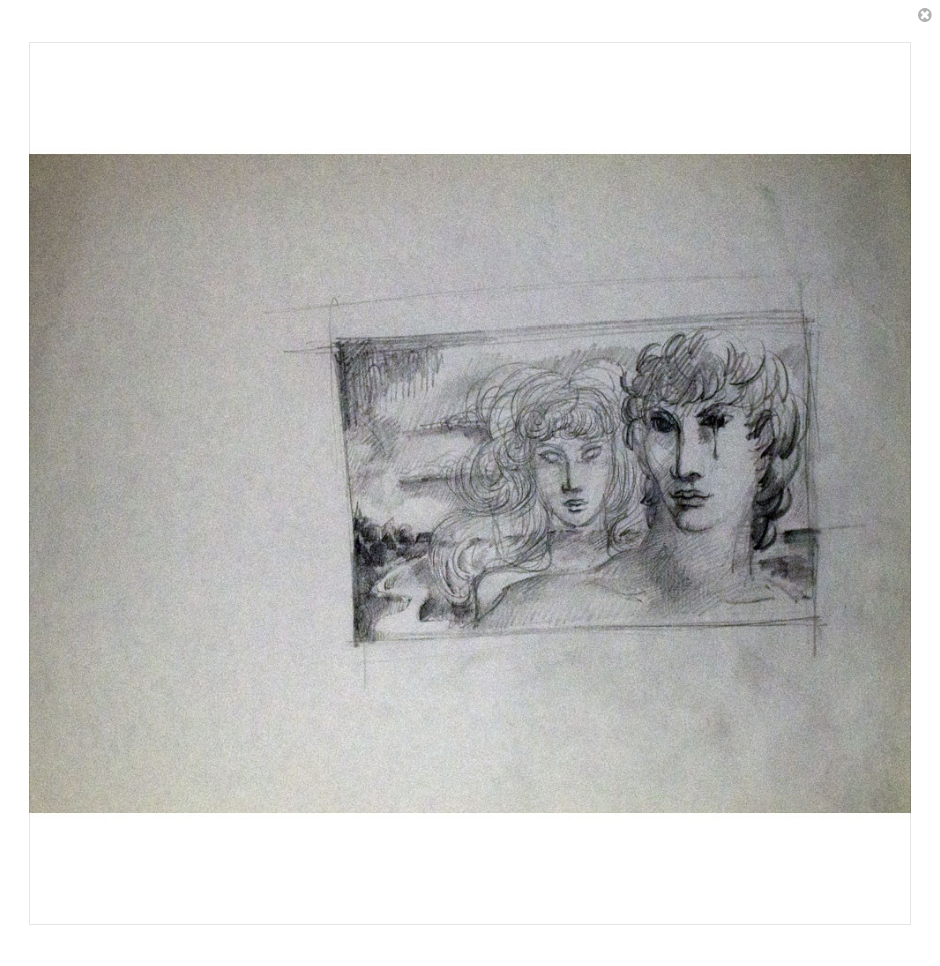
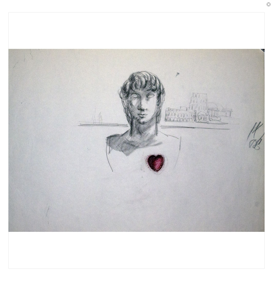
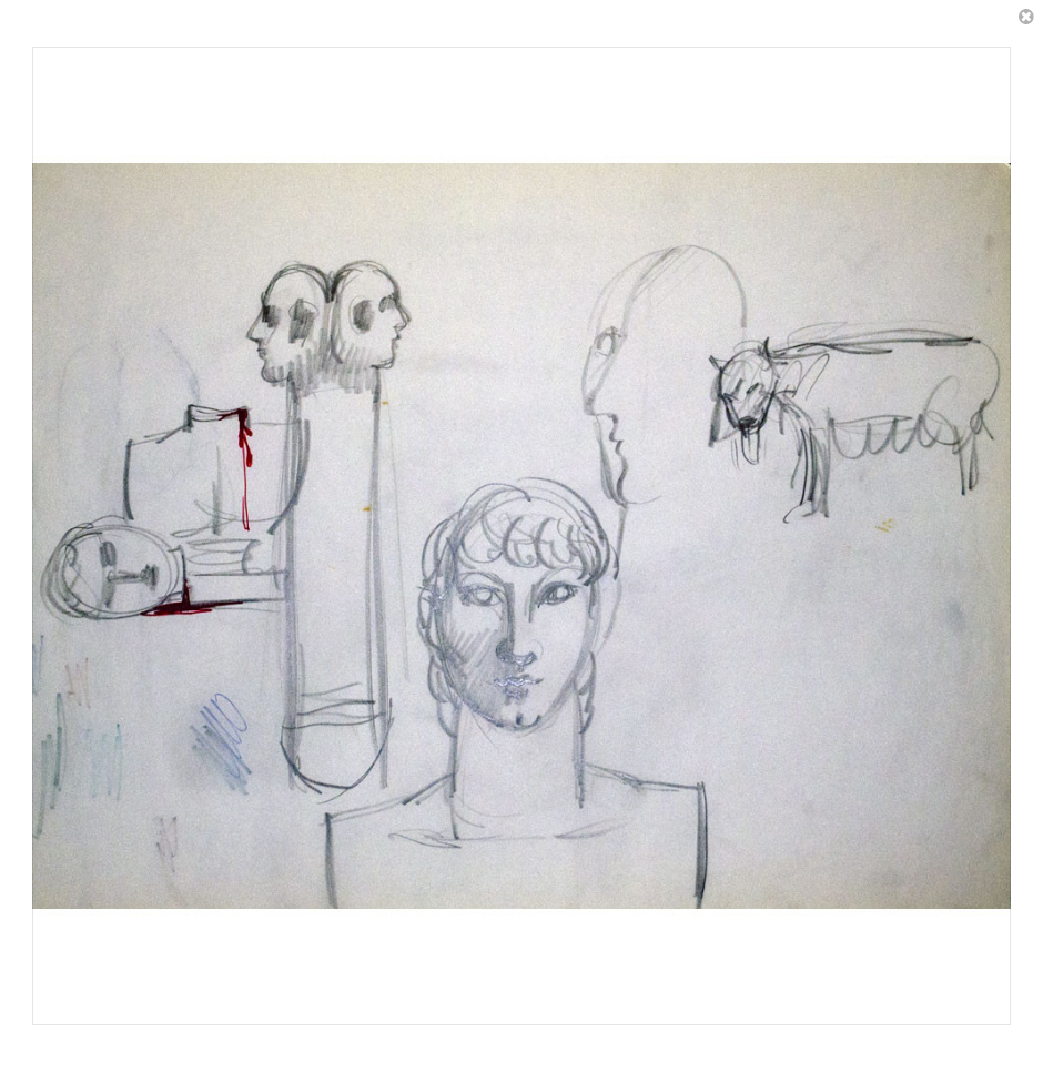
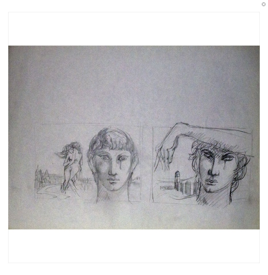
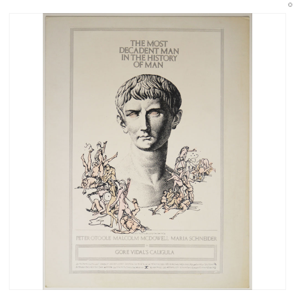
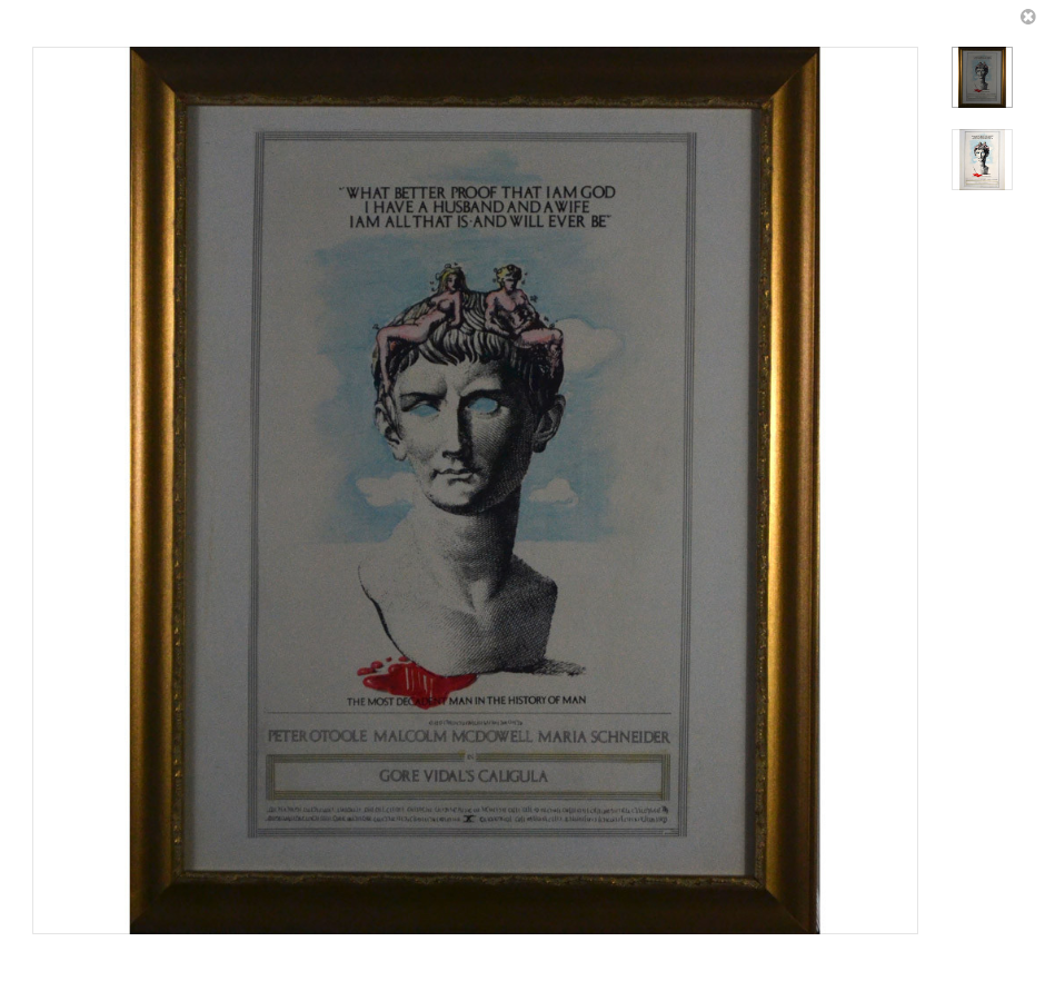
Some of the Penthouse graphic-art staff, and even, it seems, Bob Guccione himself, attempted a number of poster designs.
Those who are familiar with paperback college texts of the late 1960’s and early 1970’s on the classical world will recognize things.
Those who are familiar with theatre posters of that same time period will recognize other things.
Those who are familiar with Magritte, Cézanne, Braque, and so forth, will recognize even more.
After having taken these images down, the LiveAuctioneers web site put them back up, only to take them down again.
So, okay, here they are. I do not know who owns the copyrights, though I strongly suspect these were never protected.
Heck, LiveAuctioneers had these images posted for years, and nobody said boo.
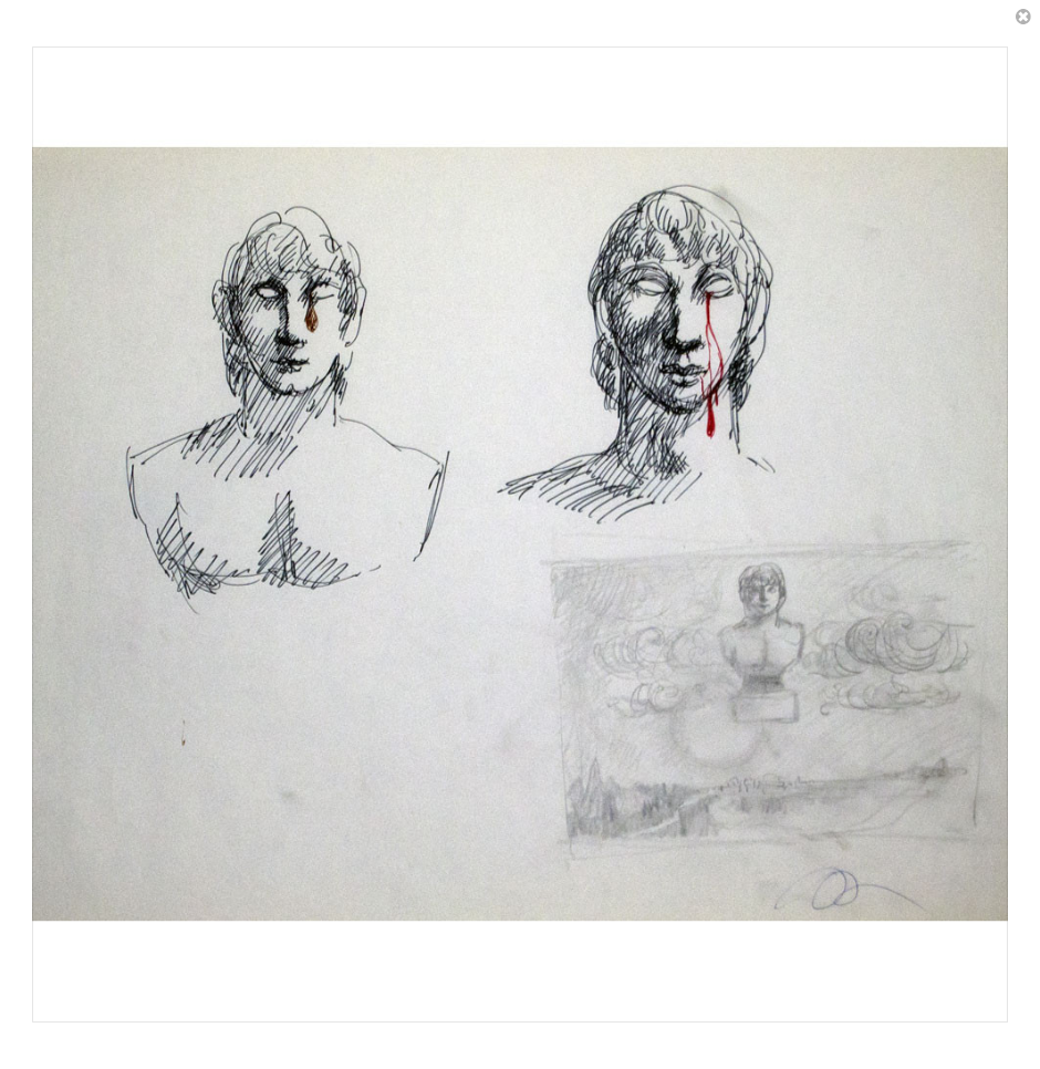
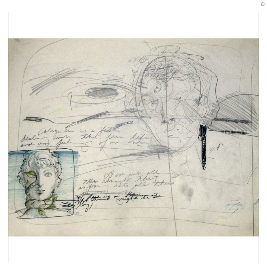 “Caligula is a film dealing with the true life and inner feelings of one man. Done with all the thought that is going into all these paintings. *Read up on Religion at the time. Might be a Key.” |
 |
 |
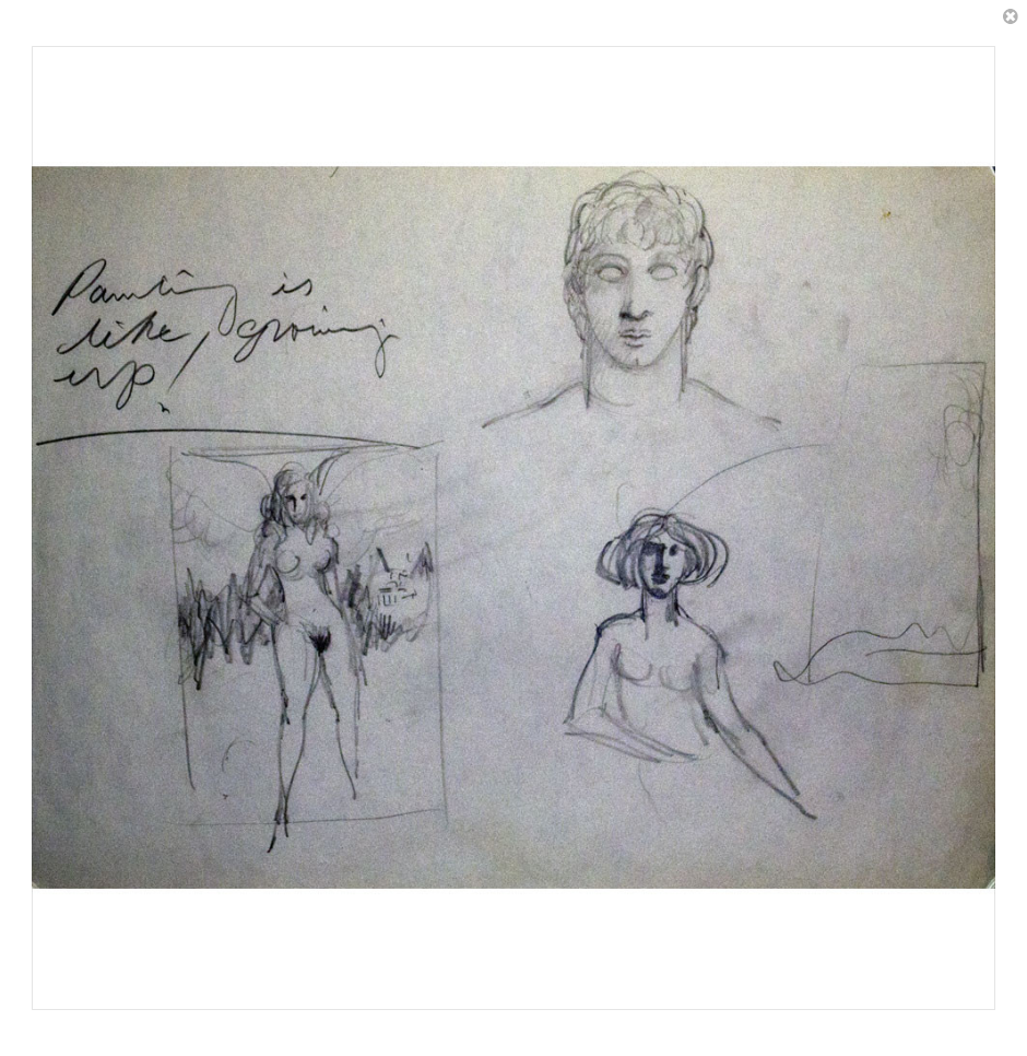 Painting is like growing up! |
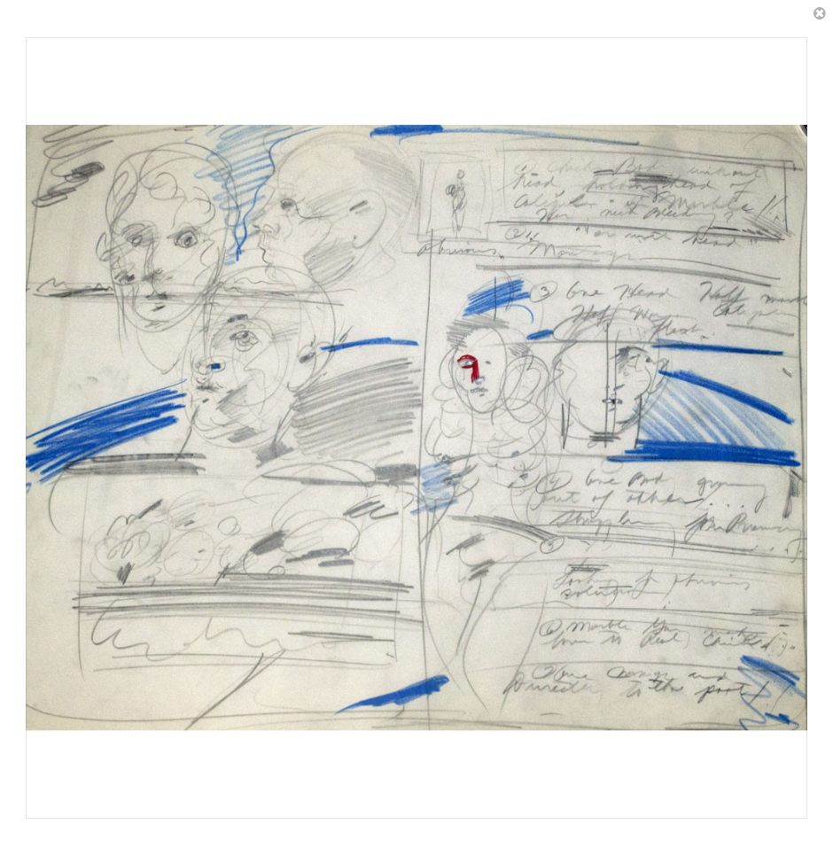 (1) Check Body without head, holding head of Caligula • in marble This not bleeding? (2) Nor with head obvious. Man ayr (3) One Head Half man Half woman. Caligula flesh. (4) One Body growing out of other... struggling for Primacy .... (5) Looking for obvious solution (6) Marble Man makes love to Real Caligula. (7) One Change and Directly to the past |
 |
 |
 |
 |
 |
 |
 |
 |
 |
 |
 |
 |
 |
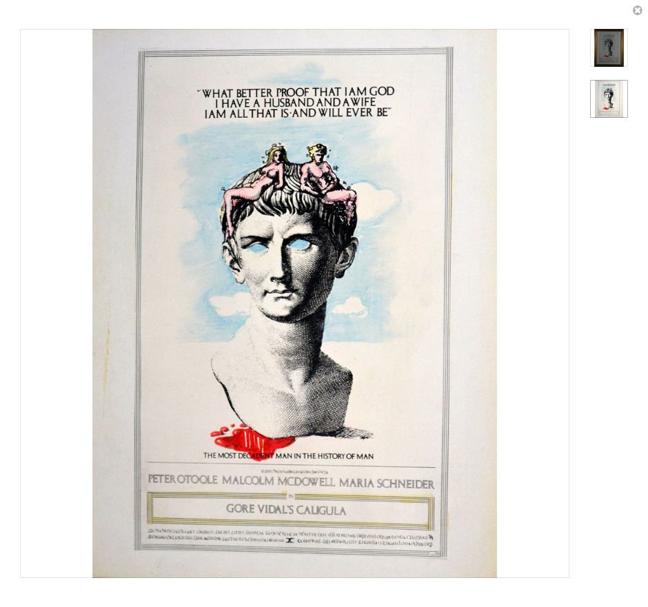
 Bond paper with paste-ins. Design similar to countless paperbacks I saw in the early 1970’s. |
 |
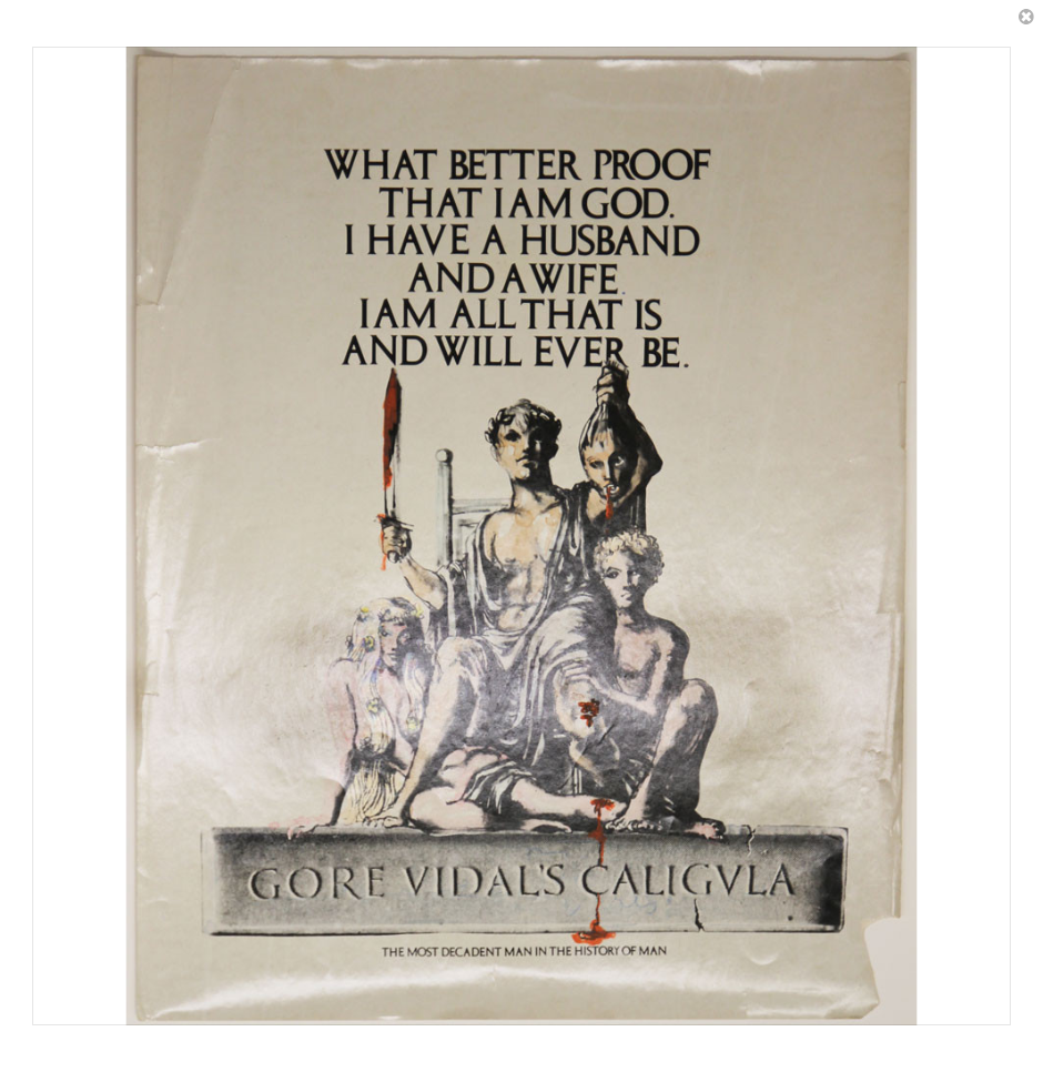
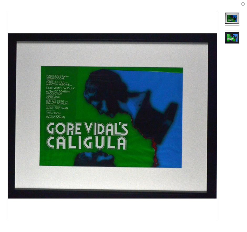 Transparency, front-lit. |
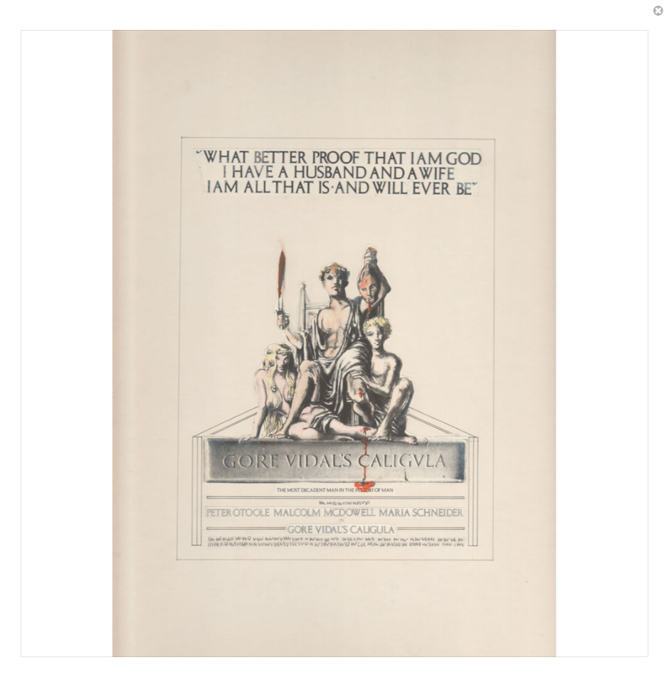
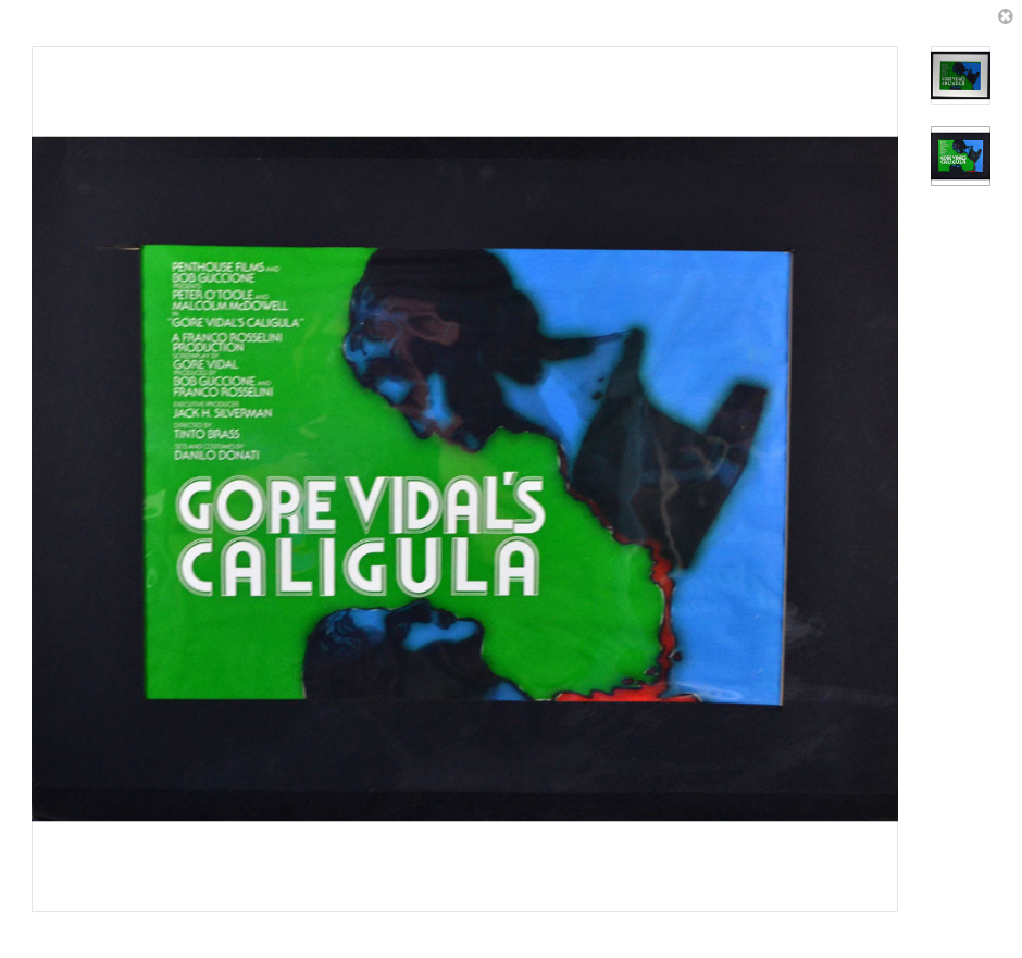 Transparency, back-lit. So similar to so many theatre posters I saw back in the 1970s. |
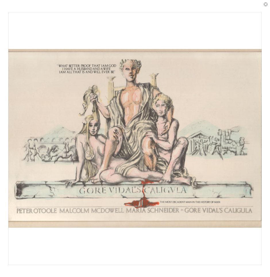
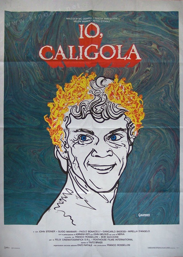
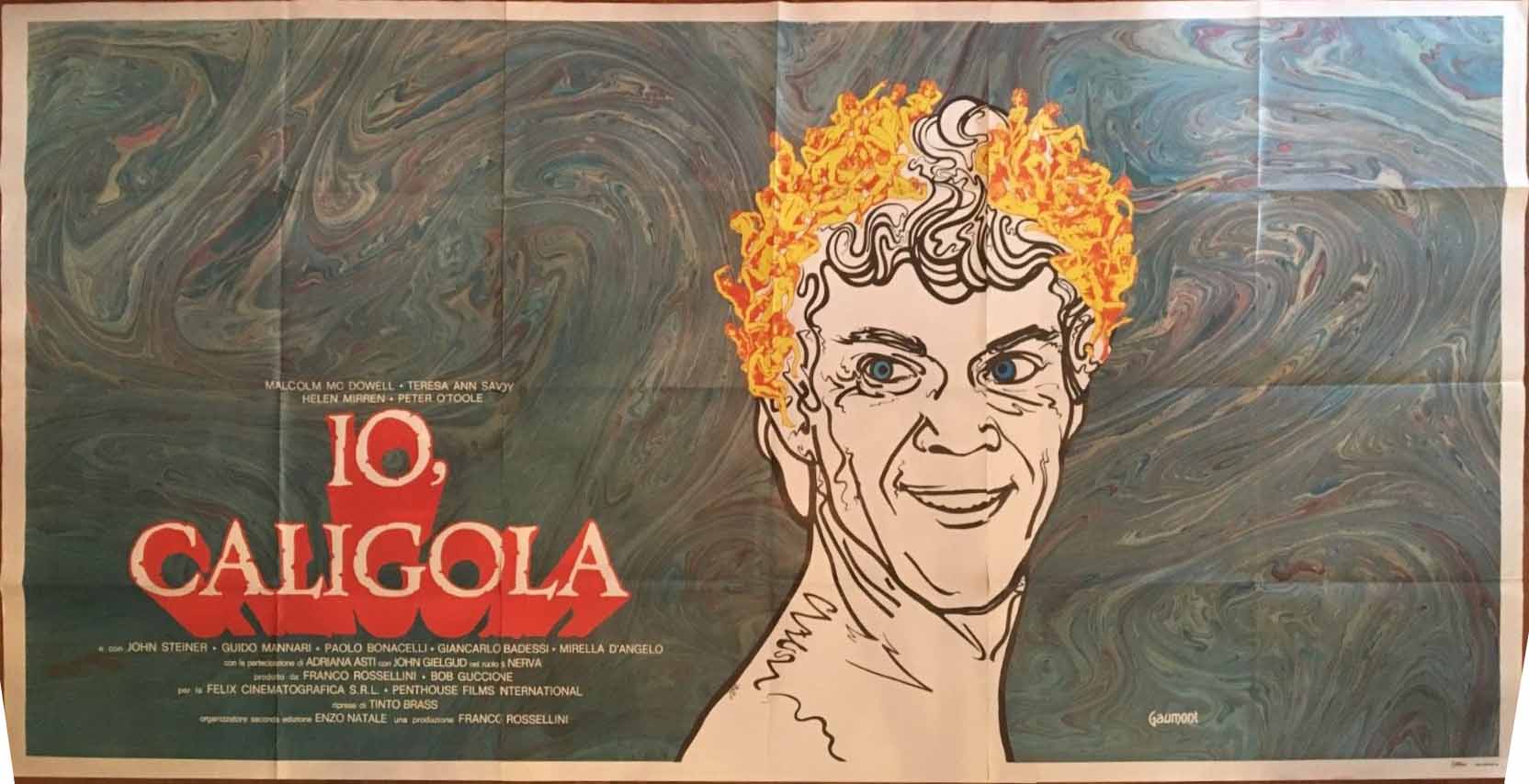
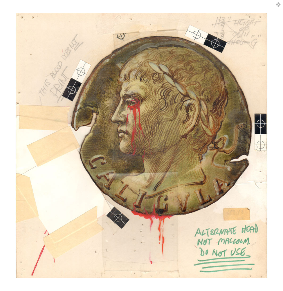 Daniel Maffia’s first submission. | What do these poster designs convey? What do they tell us about the film? What do they tell us about Penthouse’s understanding of the film? What do they tell us about Penthouse’s understanding of first-century Roman history? |
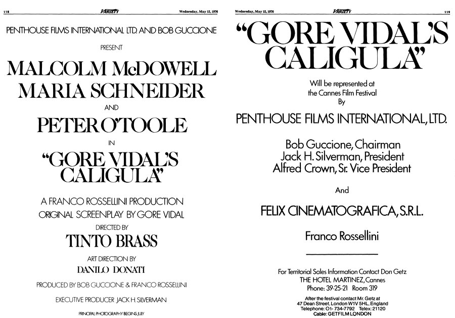
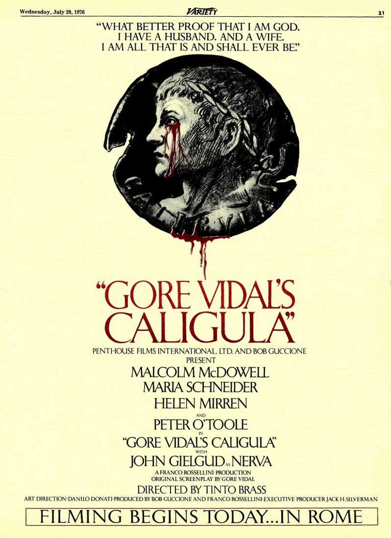
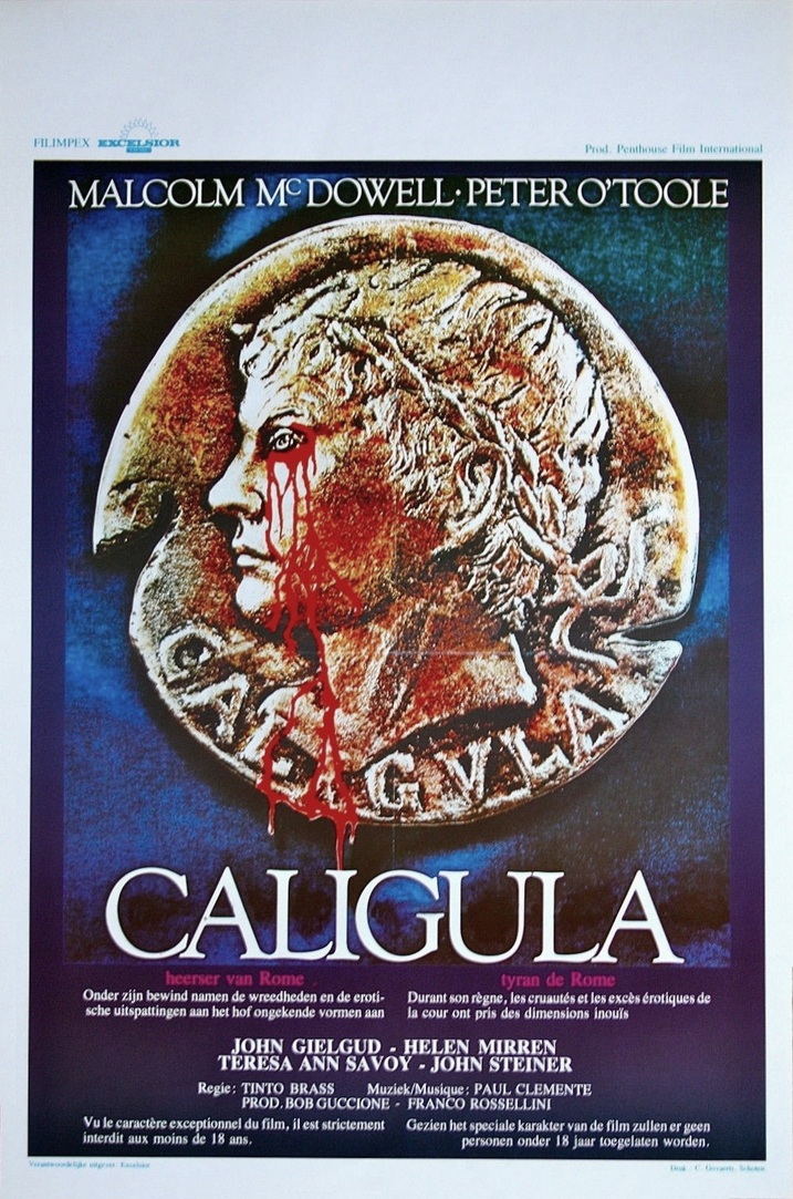
This two-page spread in Variety is unique in that it is a Penthouse-commissioned advertisement
published in the US that actually mentions Felix Cinematografica Srl,
though it cleverly does not specify that Felix is the production company.
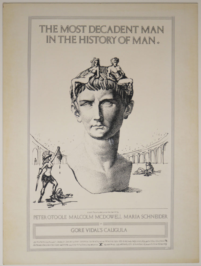
On 1 April 1976 Penthouse Films International hired well-known graphic artist Daniel Maffia (of Englewood NJ, of course)
to design a logo for a compensation of $1,250.
Four weeks later, on 28 April, Maffia delivered, and Penthouse rejected his design,
for it portrayed a Caligula who was vaguely based on ancient depictions.
Penthouse preferred a Caligula who looked like Malcolm McDowell.
Maffia obeyed, and for an additional $250 he made a new face.
It was the new face that was on display in posters and tryptichs and broadsides
throughout the 29th Cannes Film Festival, 13–28 May 1976.
Screen International & Cinema TV Today agreed to insert the above flyer
into the issues distributed at the Festival on Sunday the 16th, Wednesday the 19th, Friday the 21st, Monday the 24th,
and Wednesday the 26th.
The above full-page $469.40 advertisement was laid out by
Michael Sweret.
This identical ad appeared two days previously on the inside back cover of The Hollywood Reporter (for $1,094.58),
which demonstrates that the statement that
“Filming Begins Today” should not be taken seriously.
The actual start date had already been set at 3 August 1976.
The above was printed in two-color in Variety
not on a card-stock insert, but on a regular page of newsprint paper.
This was rather atypical for Variety, which generally printed only half-tone graphics on its regular pages,
even when the ads were submitted in color, as they generally were.
But in Variety the two-color process left many artifacts,
and converted the half-tone black-and-white medallion into something dark, smeared, and murky.
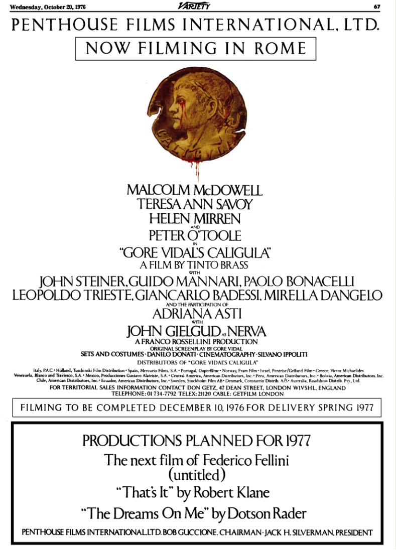
I admit it. I’m cheating here.
The ad was submitted and printed in black and white.
I took it upon myself to replace the half-tone b&w medallion with a color version.
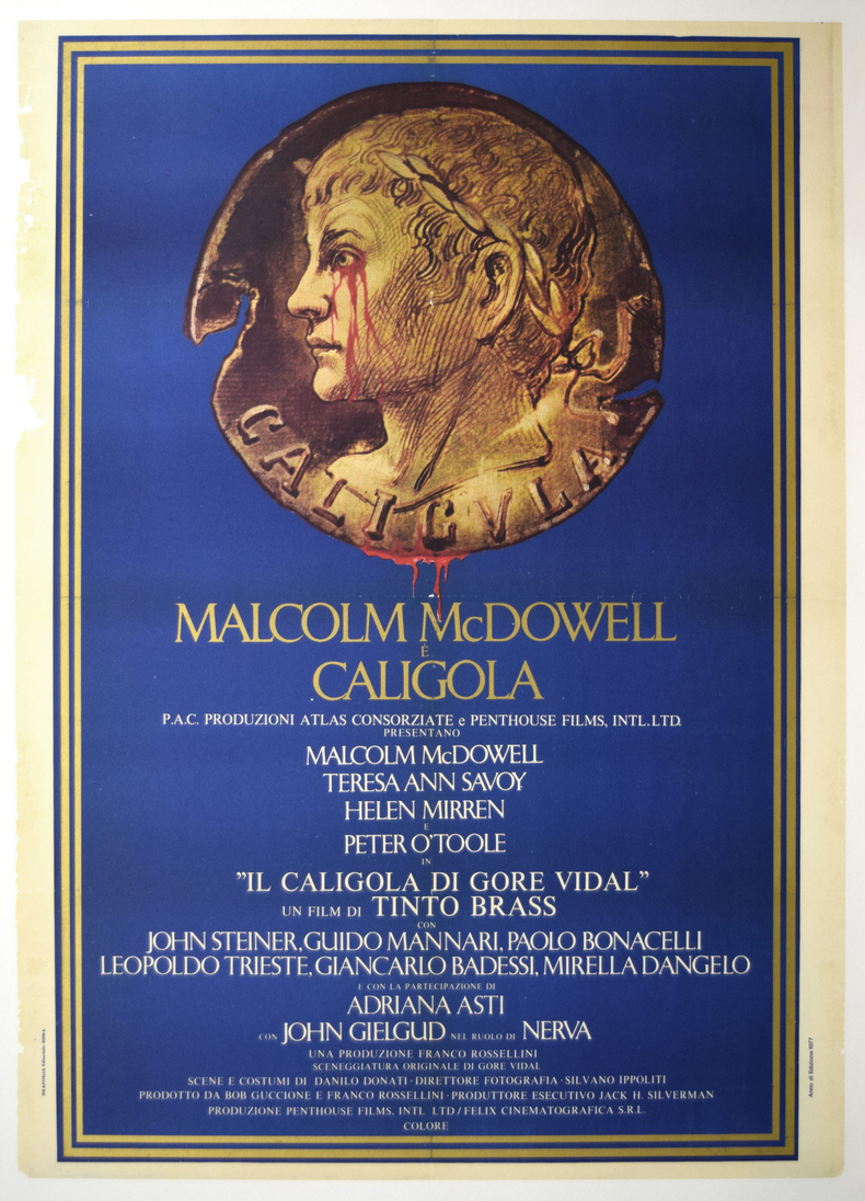
The above was printed in 1977, in anticipation of the scheduled October 1977 release.
A year later, even though the movie had not been fully edited or mixed,
the distributor, PAC (Produzioni Atlas Consorziate Srl)
sent posters out to cinemas throughout Italy,
promising an autumn 1978 release.
Tinto Brass had not yet reached a settlement with Felix or Penthouse,
so he sued and the posters were quickly taken down.
A friend noticed the above listing on eBay, during a week when I was traveling and unable to check eBay.
He bid. He won.
MALCOLM McDOWELL is CALIGULA... in “IL CALIGOLA DI GORE VIDAL.”
Is that a find or is that a find?
You will see that this poster incorporated Daniel Maffia’s logo.
Accompanying the above was a series of teaser posters.
Here’s one of them, from my own collection.
The poster is ready to fall to crumbs, and so this is as good as the scan is going to get.
I have several other posters from this series,
and if I can find the time and energy I’ll take snapshots of them and post them here.
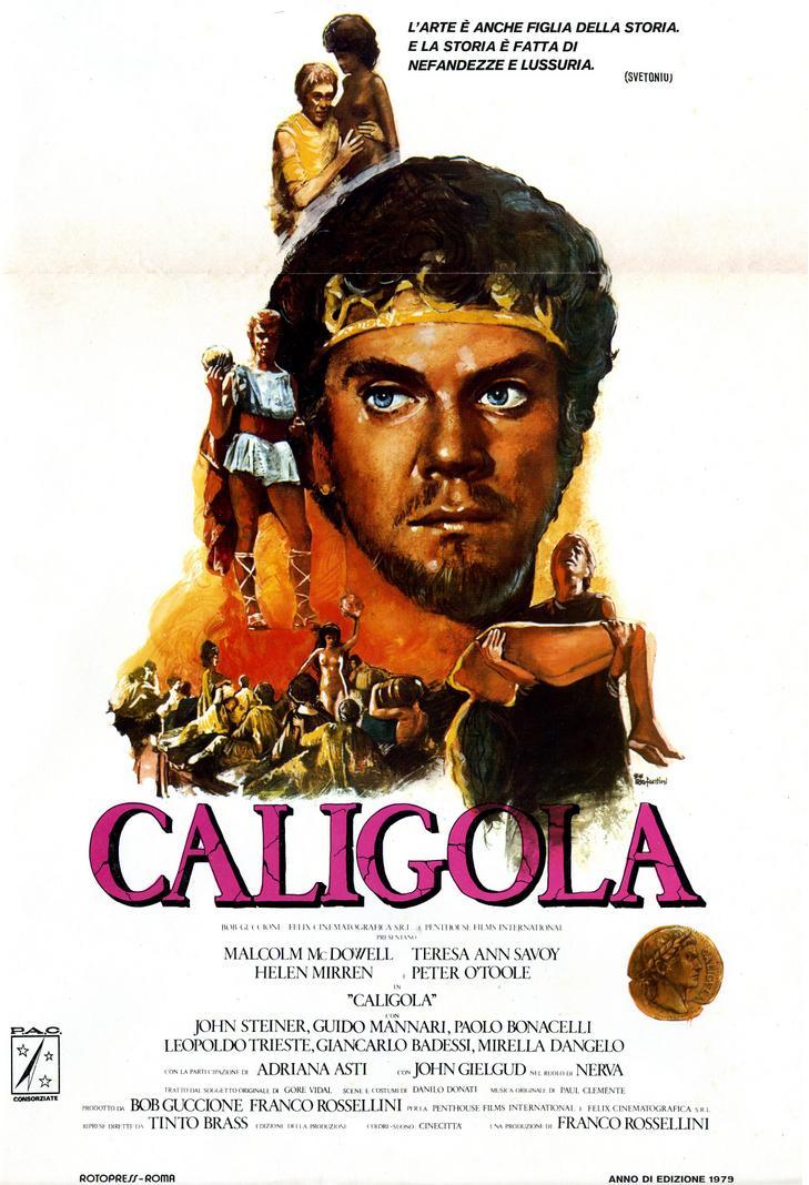
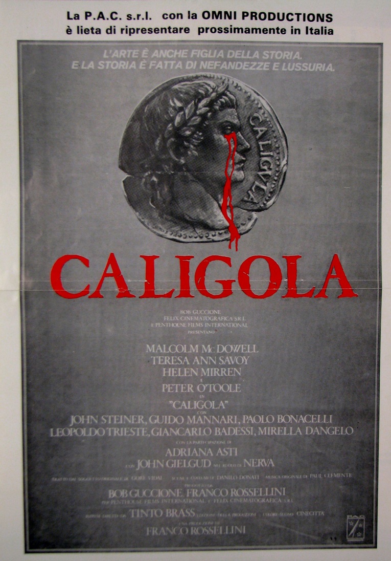
This is a locandina from August 1979 issued by PAC and Felix Cinematografica.
Yes, I have the three-panel version as well (three due fogli’s),
but for the life of me I can’t figure out how to photograph it.
Well, I could photograph it, but you’d be unhappy with the result.
And yes, I also have the quattro fogli but again, same problem.
And yes, I have that same trouble even with the due fogli . Sorry.
I’m not an expert when it comes to these things.
Note that the medallion is different.
Even though Felix and PAC had used Maffia’s logo in the teaser posters from a year earlier,
by this time they had learned the rules.
Penthouse Films International had exclusive license to Maffia’s design,
and so for the Italian release Felix Cinematografica Srl hired well-known graphic artist
Irio Fantini to create something similar to Maffia’s design.
The above poster is simple, austere, direct.
It is a good example of a logo-type poster.
But the tagline at the top ain’t too catchy:
“Art is history’s child too. And history is made of wickedness and lust.” Huh?
Supposedly that’s a quote from Suetonius.
I’ll have to hunt for it someday.
A friend in Belgium just received the three-panel poster.
He laid it out on his floor and snapped a shot, thus saving me the trouble. Yay.
Oh. Here’s the due fogli.
Either I found this somewhere on the Internet or somebody forwarded it to me.
I really can’t remember.
This is another locandina for Felix for the Italian PAC release.
Unlike the previous locandina, this one is generally referred to as “schmear.”
Each poster would draw a different audience.
This poster was apparently long in preparation,
and had surely served as the inspiration for the 1979 Felix Cinematografica poster above.
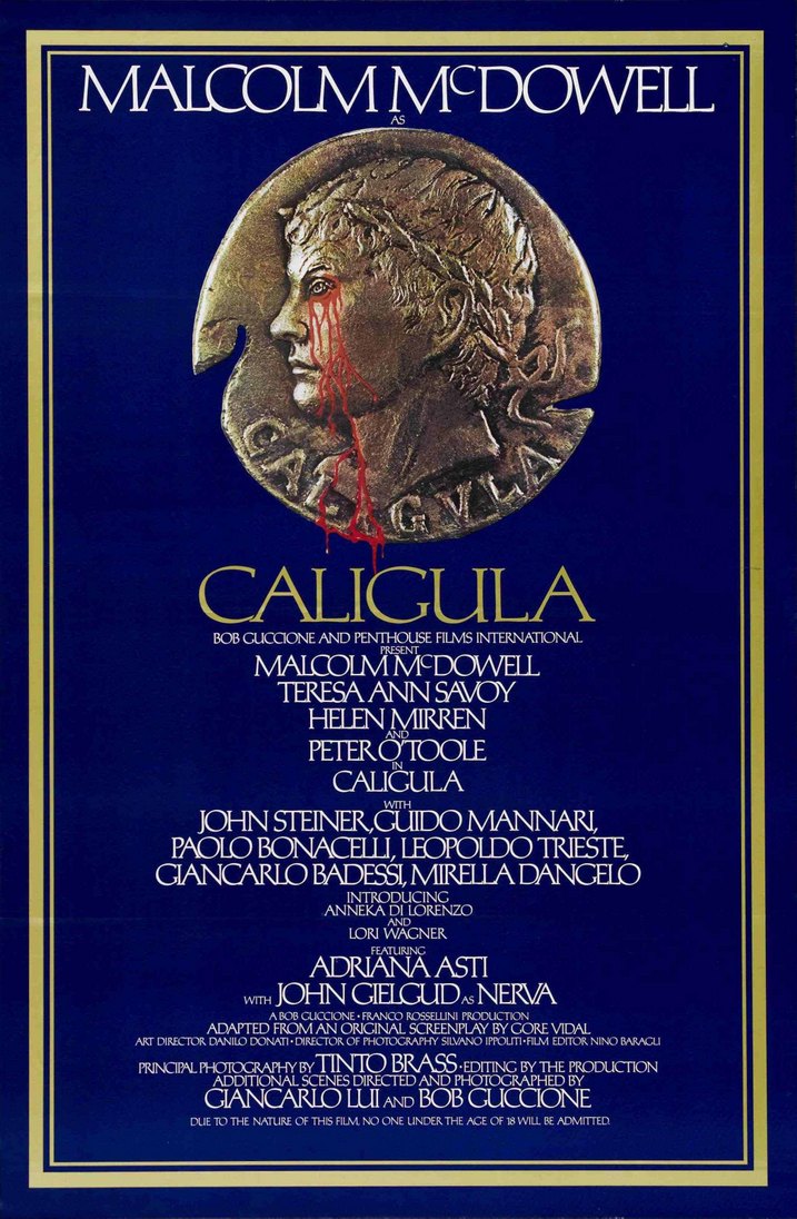
Daniel Maffia’s logo had served as the template for a real medallion of genuine gold.
I’ve been wondering for decades who the goldsmith was. We may never find out.
(WRONG! We found out! It was Gary L. Erickson.)
I had also been wondering for decades what font the graphic designers used for this poster,
but then at long last I finally noticed the most obvious thing in the world.
The writing is not typeset. It’s all calligraphy, painted with chisel-edged brushes. All of it. Every last letter.
Sort of. The font, it turns out, is a modification of Perpetua.
So this is some combination of typesetting and painting.
This is a lovely work of graphic art, simple in its classical austerity, beautifully composed and laid out.
A bit too busy, yes, but given the contractual restrictions on credits, there was no fix for that problem.
Well, almost no fix.
Penthouse did save a bit of space by omitting any mention of the film’s production company, Felix Cinematografica Srl.
Despite being a bit too busy, it’s still a lovely, evocative design.
I have no idea who the graphic artist was.
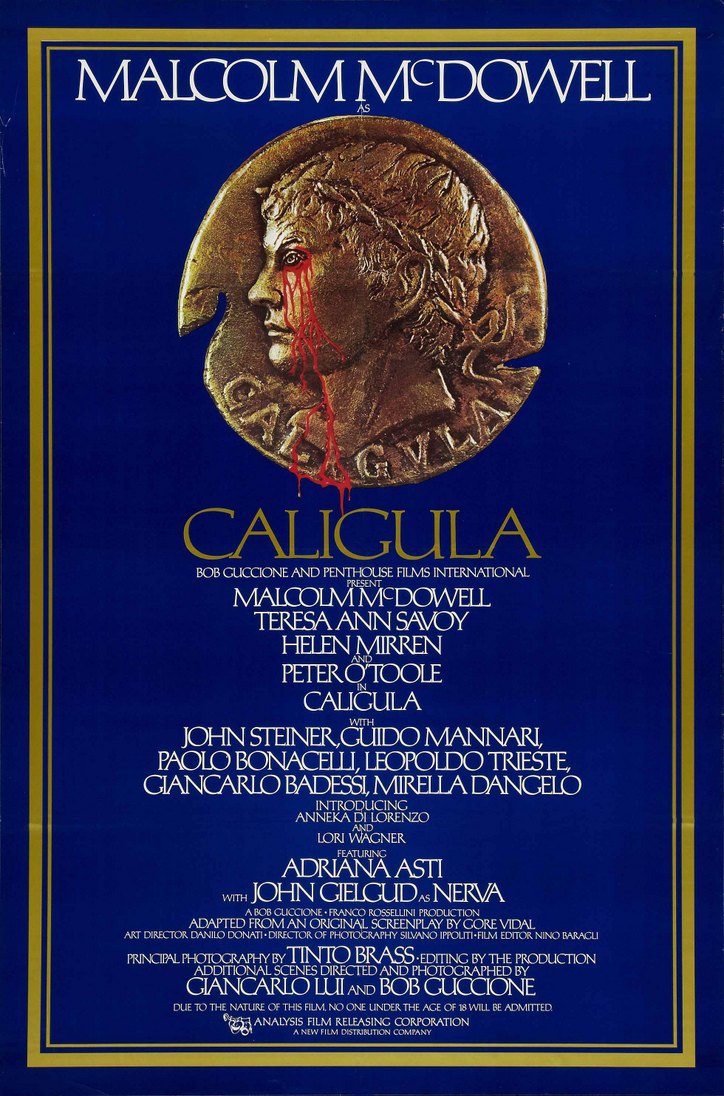
A similar poster made its world première probably a few days before.
Did you notice that the poster is off-balance?
It’s a bit high with a little empty space at the bottom.
The original poster had that empty space filled in with
THE PENTHOUSE EAST, THIRD AVENUE AT 58TH STREET
(FORMERLY THE TRANS-LUX EAST)
(FORMERLY THE TRANS-LUX EAST)
You can see that no distributor is named,
even though Analysis Film Releasing Corporation had already contracted to distribute the movie.
A term of the contract was that Penthouse would run the Trans-Lux East booking on its own thank you very much, at least at first.
Analysis would handle subsequent US bookings.
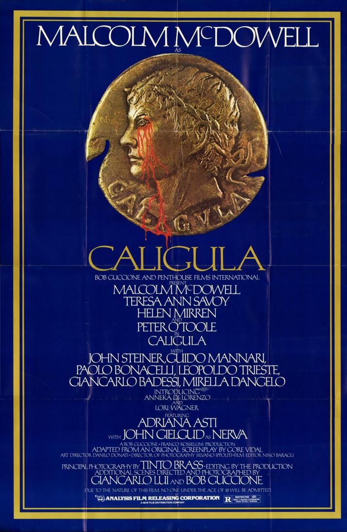
Note that, despite Guccione’s public promise, there was no “MA — Mature Audiences” rating.
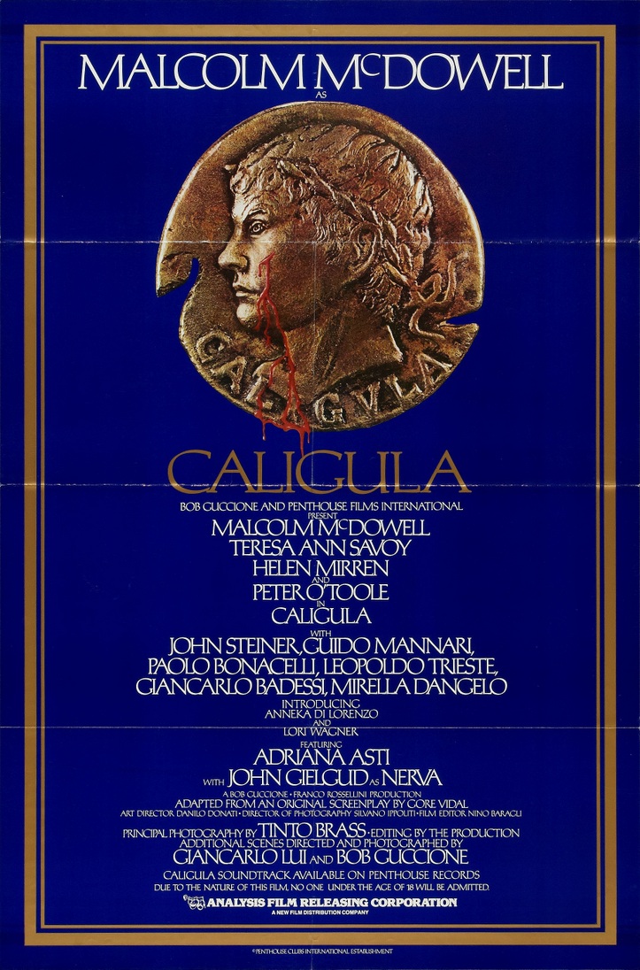
Once Analysis Film Releasing Corporation started sending out publicity materials,
this is the poster that replaced the first version.
Can you see the difference?
Look at the bottom.
In the previous poster, there was blank blue space.
In this poster the space is filled in with the distributor’s logo and name.
(My guess is that these two new lines were not newly painted,
but that someone on the graphics staff pulled letters from other lines and plopped them into place, one by one.)
Now think back to the previous poster with its empty space at the bottom.
Analysis initially wanted nothing to do with the release of Caligula in Massachusetts.
They knew it would spell trouble, and so they backed down.
Penthouse, though, had a trick up its sleeve.
One of its myriad subsidiaries, Newsconcorp, issued the movie in Massachusetts,
and I’m pretty sure that for those initial three bookings,
the blank space was pasted over with a Newsconcorp logo.
The blood is modified.
In the earlier posters the eye is bleeding.
In this poster there is a clean cut over the cheekbone.
Note the strange copyright attribution at the very bottom of the poster.
In March 1981 Penthouse got worried that the producer of the film, Felix Cinematografica Srl, might enforce its claims.
So Penthouse put the copyright in the name of an offshore branch, Penthouse Clubs International Establishment.
That threw a monkey wrench into the works and made it impossible for Felix
ever to enforce its claims on the film or to collect its share of the revenues.
Italian courts could pass rulings on this Italian film, but what other country could care less about any of that?
Note also that this poster announces that the OST is available from Penthouse Records.
That’s another long story.
When it was time to go for a wider release, an abridged “R”-rated edition was issued.
It opened in the eastern half of the US as well as Texas and New Mexico beginning on 16 October 1981,
and then in the western half of the US beginning on 19 February 1982.
Like most minor mainstream movies, it ran usually for a week or two in some first-run houses
and then either got shipped out to second-run houses or just disappeared.
But look at the poster carefully.
Do you see the problem?
It is a leftover from the original showing.
Apparently Penthouse and Analysis chose to use up the stock of original posters.
Too many had been printed and they had been lying dormant in some warehouse somewhere.
So by the simple expedient of pasting in the Analysis Film Releasing Corporation logo along with a “R” tag,
some use could be gotten out of these heretofore useless posters after all.
But the folks didn’t think to make the paste-over large enough or to glue it on in the right place.
It should have been higher, to obscure the “No One Under the Age of 18” warning.
A movie cannot be both “No One Under the Age of 18” and “R” at the same time, of course.
There were genuine “R”-rated posters too, as we can see here.
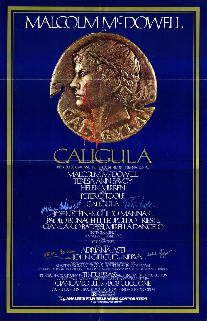
Now I got this odd poster from an eBay vendor.
As you can see, it carries the autographs of Malcolm McDowell, Helen Mirren, Peter O’Toole, and Sir John Gielgud.
The vendor included a certificate of authenticity, but even so, I have my doubts about this.
Who in heaven’s name could possibly have rounded up all four of those stars
and then gone the next step and actually gotten them to endorse this thing?
I just can’t help but be suspicious.
Because this poster is from my own collection, I was not able to get a proper scan, and so I did this in 18 panels.
The results, as the above image attests, are far from perfect.
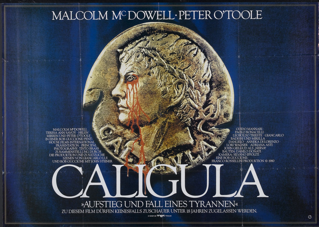
The German/Austrian release began on 27 April 1980 through Tobis Filmkunst GmBH
(Gesellschaft mit beschränkter Haftung = Limited-Liability Company = LLC).
There is still no mention of Felix Cinematografica Srl, even though Franco Rossellini brokered this deal.
He could never be bothered about details, and just assumed that everybody would behave honorably
and that everything would be all right. Wrong.
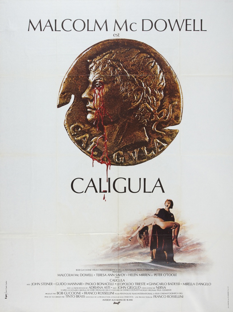
Here is the French “grande.”
AMLF (Agence Méditerranéenne de Location de Films)
trimmed 20 minutes out of the movie to avoid the heavier VAT charged to violent entertainments,
and also to allow four screenings per day rather than three.
This version of the movie was released in France on 2 July 1980 in both dubbed and subtitled editions.
Even though Gerald Kreditor of Penthouse brokered this deal, Felix Cinematografica Srl is credited.
Wait a moment. Let me catch my breath.
Belgian poster for the 8 August 1980 release.
GTO (Gem Toby Organization) Films Inc released a slightly re-edited variant of the movie on 30 October 1980
at the Prince Charles Cinema in London, where it broke all boxoffice records.
After three months, GTO started shipping prints to other cinemas throughout the British Isles.
Nippon Herald released the movie in Tokyo on 28 November 1980, with 350 – count ’em! —
350 foggings.
A week later Nippon Herald released it throughout Japan to about 150 cinemas.
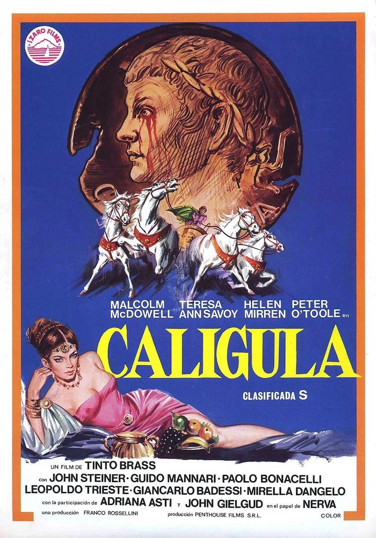
Mercúrio Films SA of Spain had invested in Gore Vidal’s Caligula back in 1976 in return for a distribution contract.
But when Guccione delayed the release by several years,
Mercúrio demanded its money back.
Penthouse needed to find a new distributor.
Sometime in the first half of 1981 Ízaro Films SA (Sociedád Anónima = Share Company)
of Spain entered into a contract with Penthouse for a release.
Here is the maddening poster.
There are only two white horses in the movie, not four.
(Yes, there were two. You’re only remembering Incitatus. Think again. Remember the pastoral idyll?
Incitatus is there together with an identical twin, apparently Drusilla’s horse.)
There is no chariot, and certainly no chariot race.
The gal in pink (based on Ornella Muti?) is nowhere in the movie.
The attribution “Un Film de Tinto Brass” is in violation of Felix/Penthouse’s settlement with Brass.
And there was never any firm called Penthouse Films Srl.
Here’s a little advert that a colleague scanned for me.
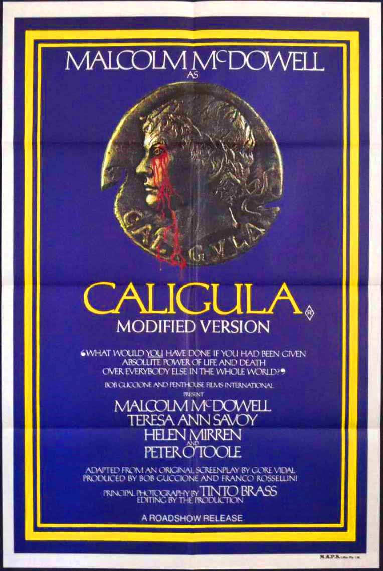
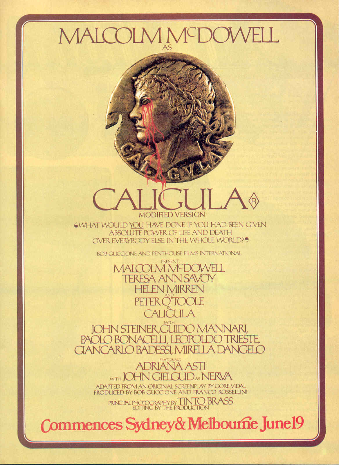
This is for the “Modified Version” released in Australia on 19 June 1981,
distributed by Roadshow Distributors Pty Ltd.
(For years and years and years I wondered what “Pty” stood for.
“Proprietary.”)
This “Modified Version” was identical to the UK edition except that one shot was deleted for reasons that escape me.
(An error perhaps?)
I have a one-sheet with this design, but have no ability to make a decent scan of it.
So I pulled this image from another site.
Click on the poster and you can probably purchase a copy if you so wish.
As you all know, the Italian censors cleared Caligola in July 1979.
The movie opened for a week-long test booking at the Cinema Nuovo in Meldola in August 1979.
A citizen challenged the censor board’s ruling, and the court dismissed the case.
Caligola was perfectly legal and could be shown anywhere in Italy without problems.
The censor’s approval of Caligola was legally definitive and could not be overturned.
The movie opened throughout Italy on 10 November 1979, proving itself to be a boxoffice sensation.
Except that a few days later it was challenged again, and under political pressure the court reversed its earlier dismissal
and banned the film in its entirety. Every last frame of it.
After being under wraps for several years, there were some rumblings that maybe a revised version could be cleared for release.
That led to the above flyer, created in February 1984 in anticipation of the May 1984 Cannes Festival.
Pretty lousy design, filled with misspellings and uneven typesetting.
Of course, this was never printed or handed out anywhere.
By May the movie had been retitled and PAC was uninvolved.
So you’ll never get a copy of this flyer and neither will I.
Consider yourselves lucky to be able to see this snapshot.
This is all you’re ever going to get.
Nope. You’ll never find this one either. This is a draft for a proposed release.
This draft was obviously created in early February 1984,
but by the time the revamped edition of the movie was issued at the end of March,
it carried a different title and PAC’s contract had been bought out twice over.
So this design was never used again.
This was the new title, and this was one of the new posters for the new Gaumont Italia Srl release on 31 March 1984.
I have a locandina with this design somewhere in my collection,
and I refuse to make an effort to find it because I have too much else to do.
Obviously inspired by Van Gogh, and with a bizarre hairpeace
that’s based on a rejected poster designed in 1976 by someone on the Penthouse graphics staff.
Until a friend recently acquired this three-panel poster for Io Caligola,
I did not know that there was a three-panel poster for Io Caligola.
Did you?
As with the original 1979 release, there were two versions of the poster for the 1984 release as well.
Somewhere in my collection I have a locandina with this design as well as a quattro fogli.
It will probably be years before I dig them out from storage.
This one’s deserving of a prize. See? Look.
There we go again, another of the limitless Penthouse goofs, gaffes, faux pas, muck ups, blunders.
But I love it!
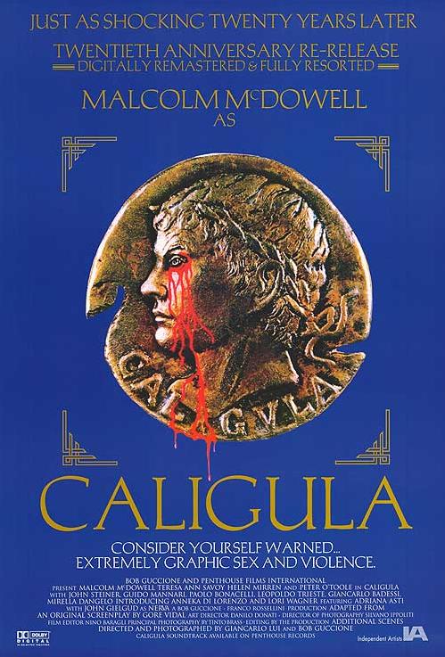
Penthouse had promised that the autumn 1999 reissue would be the long-awaited “director’s cut.”
That was rather a bizarre claim, and I had trouble believing it when I read the announcement in Boxoffice magazine.
I had not heard any news about Tinto getting back into the editing room to rescue this mutilated movie.
And, of course, he hadn’t.
I was correct to be wary.
Guccione promised that an
extra 12 minutes of never-before-seen footage (all plot, no sex)
would at last be integrated into the movie.
Now that got my hopes up.
And then I saw the poster at the Angelika 8 in downtown Buffalo,
and it looked like Guccione’s promise was about to be made reality!
Not only would the movie be “digitally remastered” (an overused phrase that does not make my heart flutter)
but it would also be “fully resorted.”
So I paid my money and even though I knew that the Angelika would crop the film terribly (which it did)
and project it out of frame (which it did), I could hardly endure the anticipation of seeing
how the scenes would be resorted.
Alas, I should have been more cynical.
Nothing was resorted.
This was just a dupey-looking reprint with faked stereo derived from the mono knockdowns of years afore
(and presented by the Angelika in mono anyway), with a massive gouge on the interpositive in one scene.
Same old 156' version. Nothing new. Nothing resorted.
And what about the extra 12 minutes that Guccione had promised us?
Well, he apparently did not realize that the dialogue, effects, and music had never been recorded for those scenes anyway.
So there.
In addition to the large gaffe at the top, there are more below.
The line breaks were cleverly employed to force “AN ORIGINAL SCREENPLAY BY GORE VIDAL”
and “DIRECTED AND PHOTOGRAPHED BY BOB GUCCIONE AND GIANCARLO LUI” to the beginnings of lines.
Look again. Those are continuations of the previous lines,
and chances are that most people taking a look at this won’t notice that the crucial phrases
“ADAPTED FROM” and “ADDITIONAL SCENES” should be taken into account.
Clever. Very very very clever.